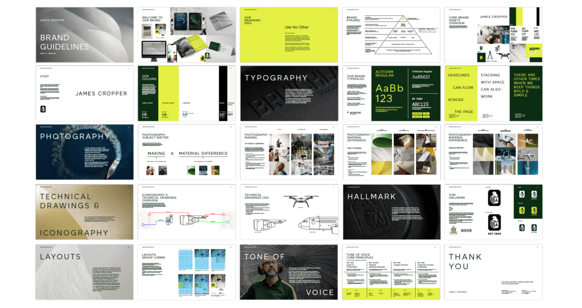
REBRANDING A GLOBAL PAPER & PACKAGING AND ADVANCED MATERIALS COMPANY
James Cropper are a pioneering materials business made up of the most brilliant minds in the field. A six generation family owned business and pioneers in manufacturing paper & packaging and advanced materials for global markets.
We worked closely with the James Cropper team to re-brand them in the market, creating a single-minded, forward-thinking brand and business of the future.
Built from our brand idea and proposition of ‘Like No Other’, we created a brand system that supports the company’s diverse global client base.

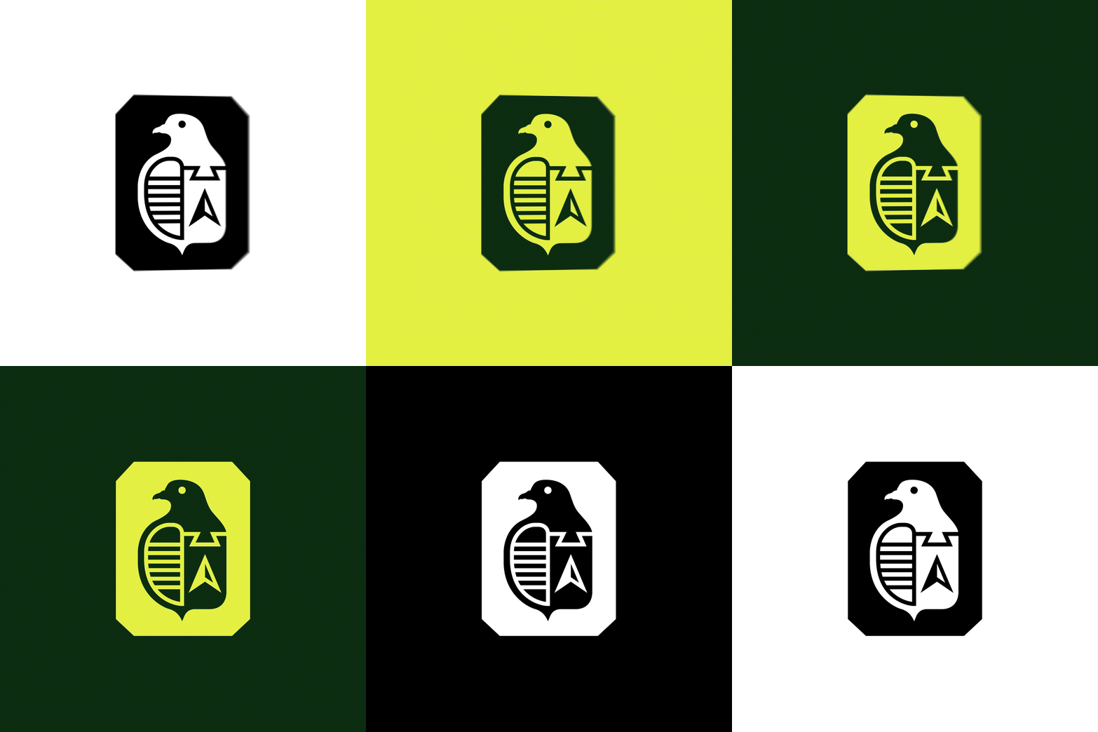
The logo was redesigned to reflect a more confident, contemporary and refined aesthetic, a true representation of the James Cropper brand. The existing hallmark was retained yet modernised with the use of a fresh new colour palette, and key usage rules that enhance its marque of quality and heritage.
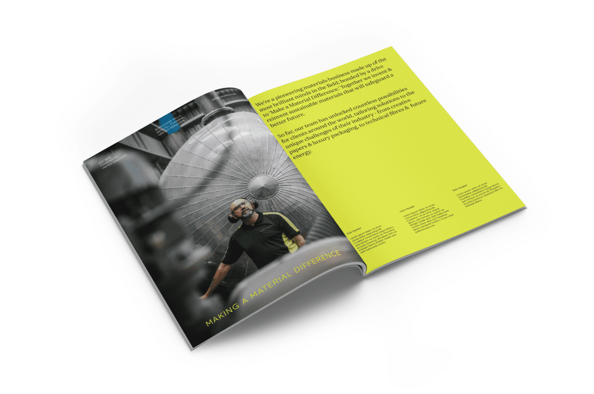
Colour holds immense significance to the James Cropper story. They have been specialist leaders in colour since 1856, with the Burneside, Lake District mill being one of the first in the world to make coloured paper from synthetic dyes.
We took advantage of our existing strong, positive and recognisable association with the green, and projected it into the future. A bold, fresh, modern and reduced palette was introduced that has the flexibility to be used across all areas of the business, platforms and channels.

A flexible, but consistent photographic approach was developed to recognise the people, expertise and solutions that James Cropper provide and was built around a system of Micro – Mid – Macro, guiding how we shoot product storytelling imagery. Micro – close-up details; Mid – Materials found in products; Macro – Further away / aerial.
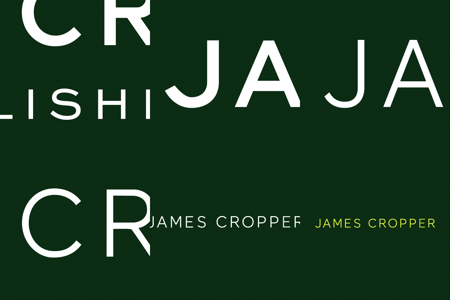
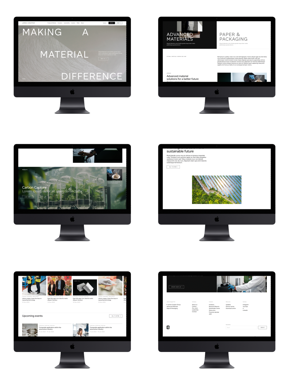
During our immersion into the James Cropper brand, we learned that manufacturing materials by layering is crucial to the process, with water also playing a huge part. Whilst drawing inspiration from these processes, we created a visual composition and typographic style that runs throughout the brand, creating a consistent and harmonious visual language across all touchpoints.
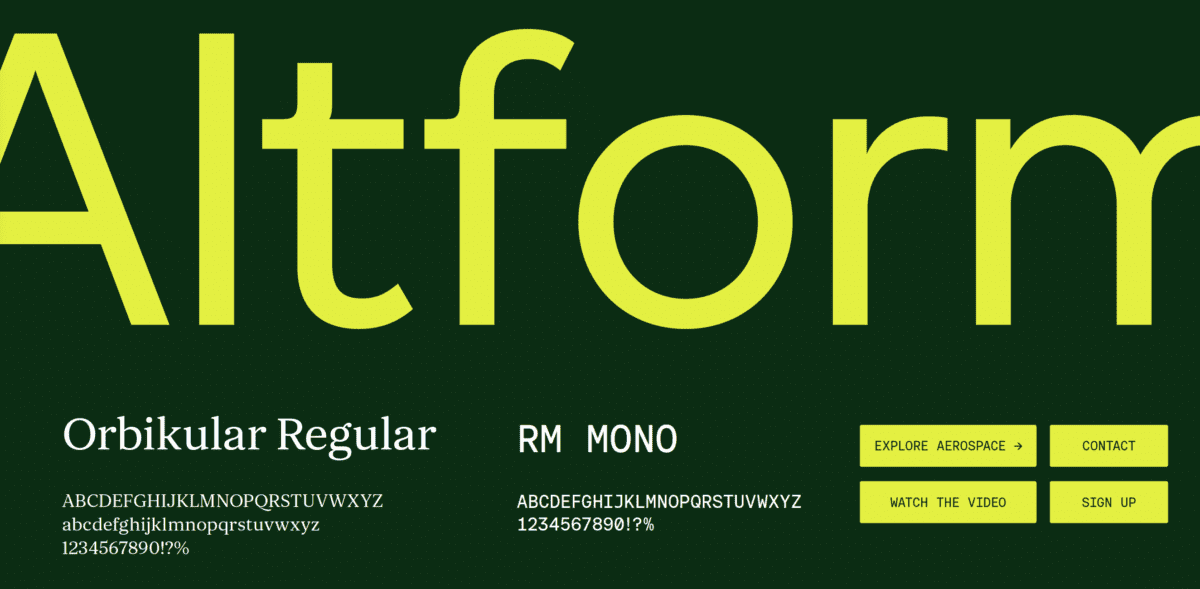
We introduced three new typefaces, each with their own personality, style and role to play. Contemporary & confident, our headline typeface Altform is functional and geometric in form with a strong yet balanced aesthetic. Orbikular Regular, a serif typeface, that linked back to the heritage and prestige. RM Mono became the technical, directional and call to action typeface.


Testimonial
